Bonobo
A social language learning experience powered by friendship and community support.
Overview
As an immigrant to Canada, I’ve always been curious about the challenges of learning a new language. During my senior year at Sheridan College’s Interaction Design Program, I had the opportunity to focus my skills on a project exploring ways to help people achieve success in language learning, especially given the mixed feedback surrounding online learning methods.
Design Brief
Key Audience
1.
Individuals struggling to achieve satisfying results in asynchronous language learning environments.
2.
People interested in learning a language through social and cultural contexts.
Design Sprints
1.
Sprint 1 (3 months) was dedicated to the discovery, research, and ideation phase.
2.
Sprint 2 (3 months) focused on additional research, analysis, and design.
Problem
Around 90% of people fail to continue their second language learning in an online environment.
1
Commitment Issues
Struggling to stay committed is a common obstacle, often driven by the lack of motivation and support in a solitary learning environment.
2
Isolation
The absence of meaningful connections leaves learners feeling alone, limiting their engagement and enthusiasm.
3
Absence of Social Context
Without access to real-world interactions, learners miss valuable opportunities to immerse themselves in the cultural and practical aspects of language use.
Solution
Bridging the gap between in-person and online language learning experiences.
1
Fostering Commitment
Bonobo cultivates a sense of accountability by embedding users in a supportive network of language buddies and a vibrant community, making it easier to stay committed and motivated.
2
Building Connections
By emphasizing friendship and collaboration, Bonobo transforms the isolating experience of online learning into one that thrives on meaningful relationships and shared growth.
3
Creating Real-World Context
Bonobo bridges the gap between in-person and online learning by recreating social and cultural contexts, offering learners opportunities to practice and immerse themselves in dynamic, interactive settings.
Research
Understanding the Challenges in Online Language Learning
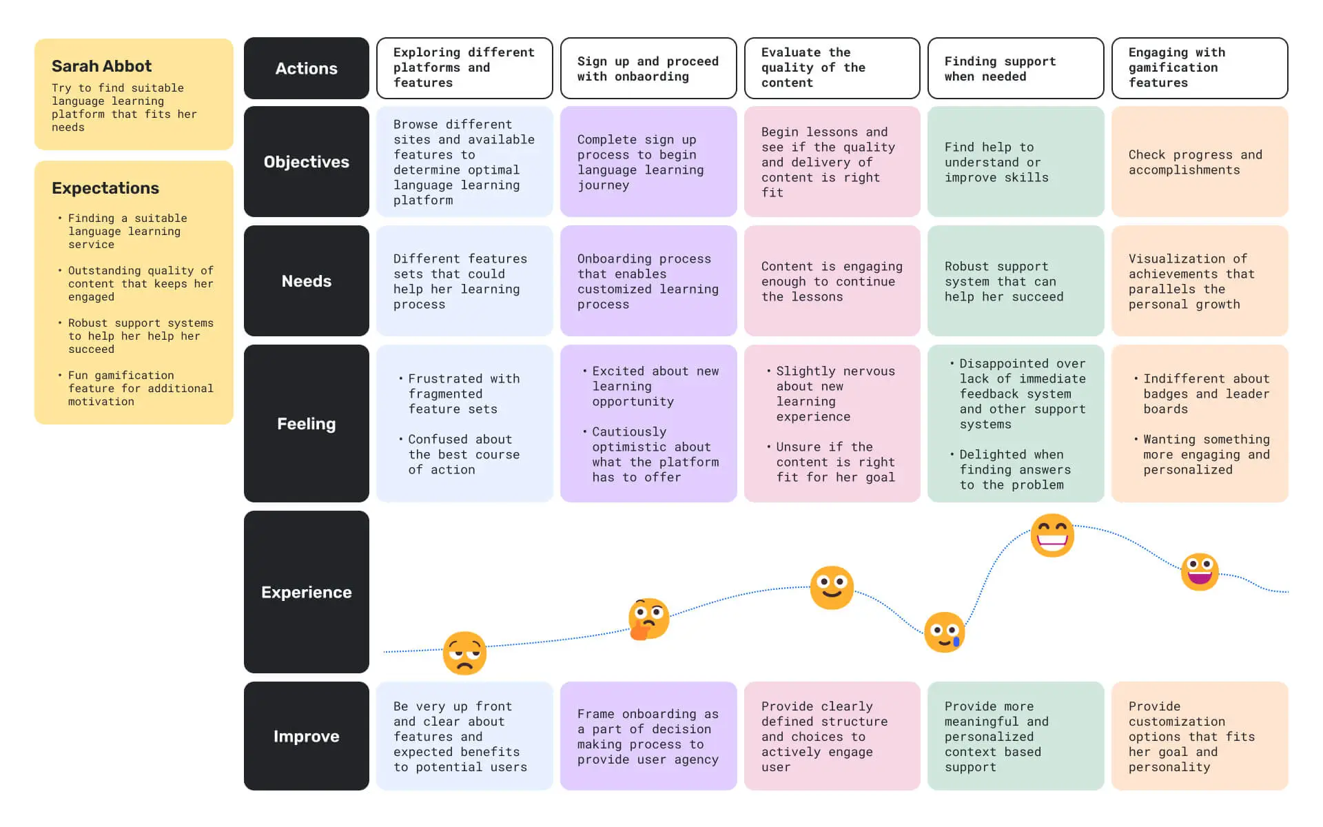
The goal of learning a new language is often linked to personal and practical objectives. Whether it’s to boost career opportunities or to immerse oneself in a different culture, language learning is fundamentally about fostering connections with others. Yet, an important question arises: Why do people with clear goals abandon their language studies? To address the gap between user needs and the online language learning experience, the following plan was developed.
Objective
1.
Learning Preferences of the User Base
2.
Learning Motivation and Decision-Making of Learners and Educators
3.
Biases and Assumptions in Research Data
4.
Convergence Point in Research Findings
5.
Opportunities gleaned from Competitions
6.
Foundation for Design Direction
1.
Learning Preferences of the User Base
Based on results gathered from 29 respondents using Google Forms.
92%
Found quality of experience has the biggest impact on decision making process.
77%
Want social learning environment that supports more personalized learning with robust feedback.
68%
Prefer environment that supports learning through social interaction.
63%
Want emphasis on cultural aspect in language learning.
62%
Think lack of personal motivation being an obstacle for new language learning.
62%
Want to be part of decision-making process for their education.
2.
Learning Motivation and Decision-Making of Learners and Educators
Interview results based on five participants and one Teaching English to Speakers of Other Languages (TESOL) Professor from Sheridan College.
Balanced Approach
Finding the balance between convenience of online platforms and benefits of in-person social learning.
Social and Cultural Goals
Focus on achieving personalized social and cultural goals with new languages learning.
Group Dynamics
Learning in groups settings can influence people and act as positive reinforcement for motivation.
Commitment
Making a commitment and willingness to take risks is a crucial part of a learning experience.
User Agency
Include users in decision-making process for their own education process for better participation.
3.
Biases and Assumptions in Research Data
Unrealistic Expectations
Marketing and skewed public perceptions often lead people to develop expectations that don't match reality.
Favoring Convenience Over Effectiveness
Some prioritize their personal comfort, disregarding the true impact and effectiveness of educational approaches.
Overconfidence in Self-Motivation
Many believe they'll stay committed, but it can be challenging to maintain focus and dedication when learning independently.
Underestimating the Challenges of Online Learning
People often assume that online learning is easier than traditional methods, overlooking the unique difficulties it can involve.
4.
Convergence Point in Research Findings
Social Interaction
Strong recognition of social learning experiences is afforded by in-person learning.
Context-Based Learning
The social context is a crucial part of the language learning process.
Group Experience
Collective group experiences may leave a bigger impression, leading to better engagement.
5.
Opportunities gleaned from Competitions
Removing Learning Barriers
Removing artificial roadblocks designed to funnel people into monetization features, disrupting immersion and study flow.
Feedback With Contexts
Pivot away from endless repetition and provide meaningful feedback or context based error correction.
Community Over Competition
Emphasize supportive community features over aggressive gamification features prioritizing competition.
6.
Foundation for Design Direction
Community Support
Emphasize fostering long-term engagement by integrating community features that create a sense of belonging and provide ongoing support.
Social and Cultural Learning
Offer contextual insights and practical tips to promote deeper understanding and meaningful learning, moving beyond mere repetition without context.
Design
Building a Supportive Community
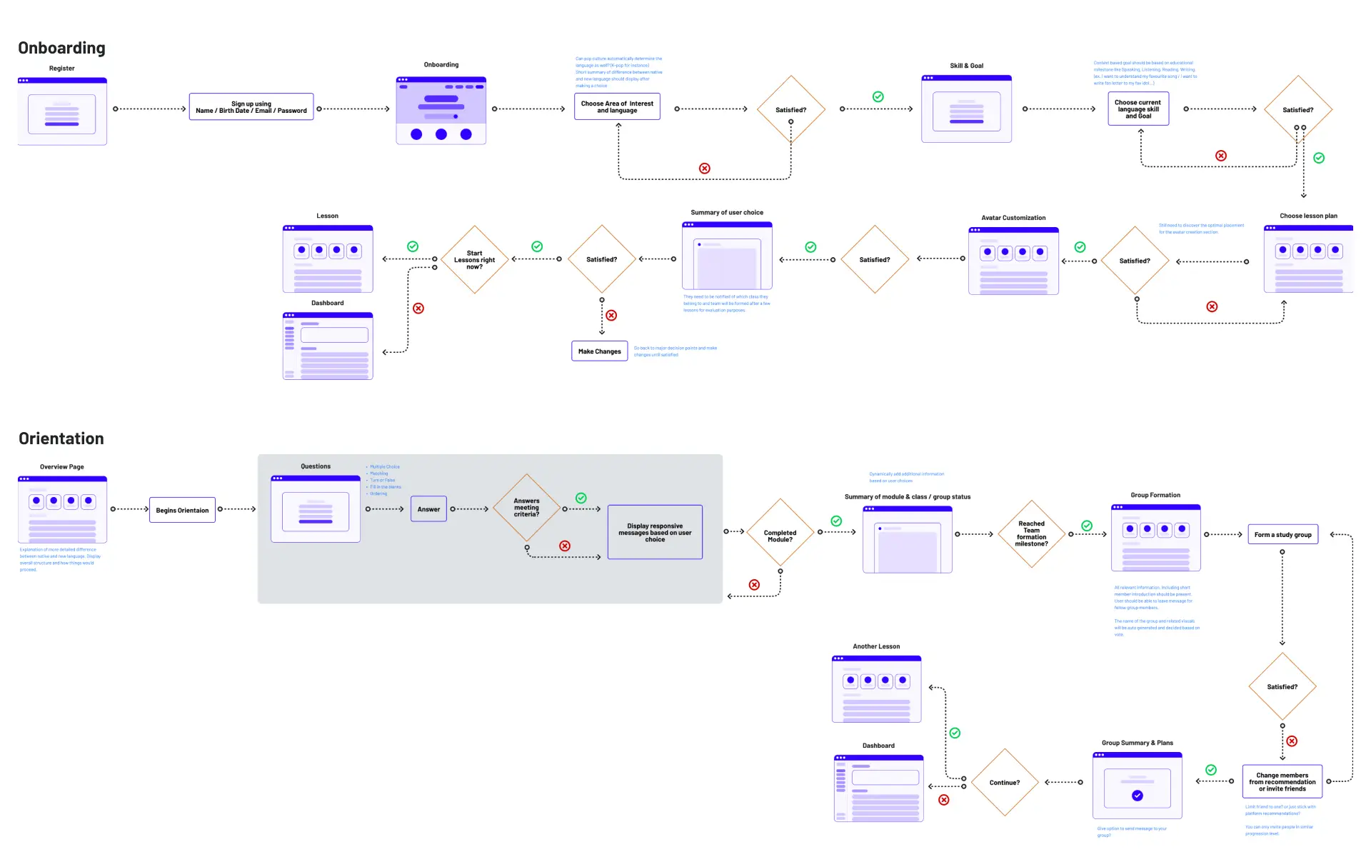
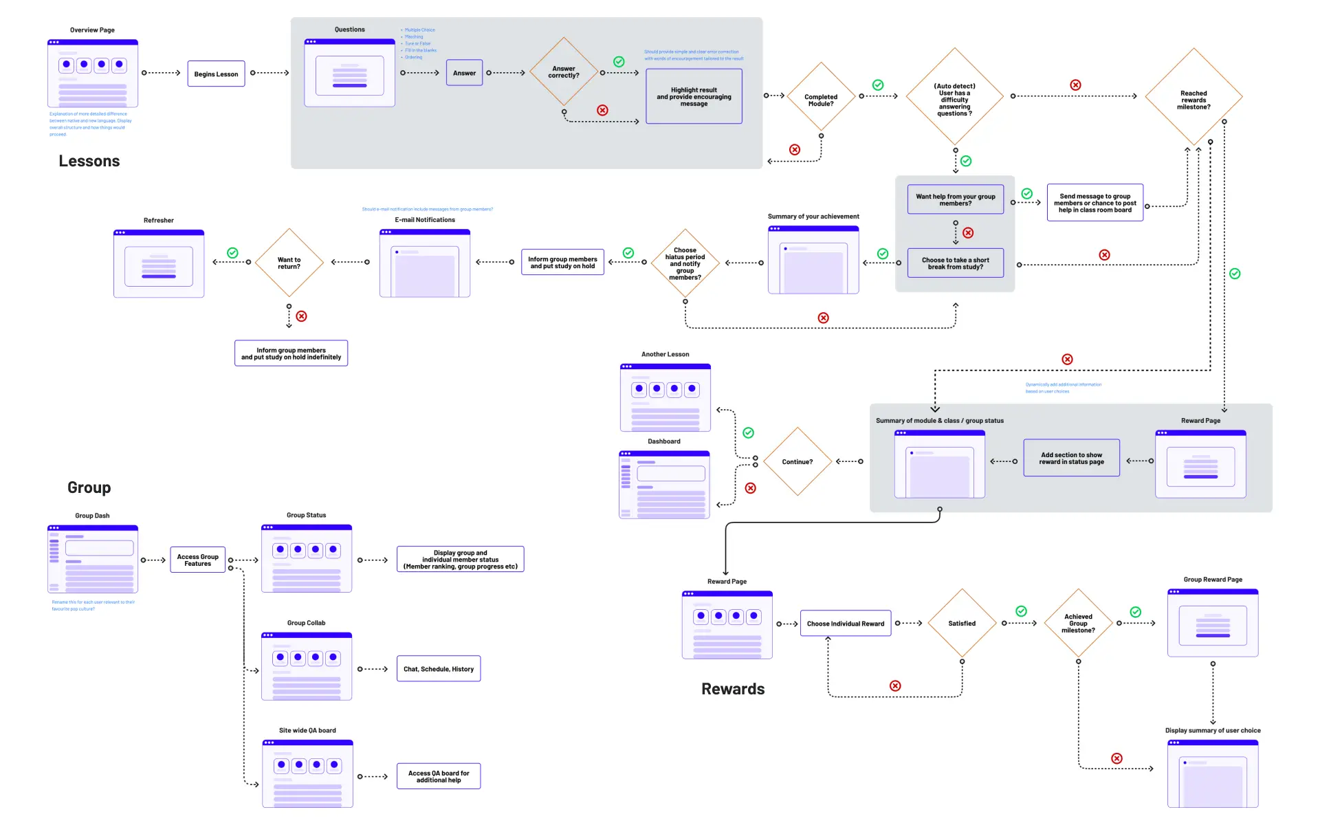
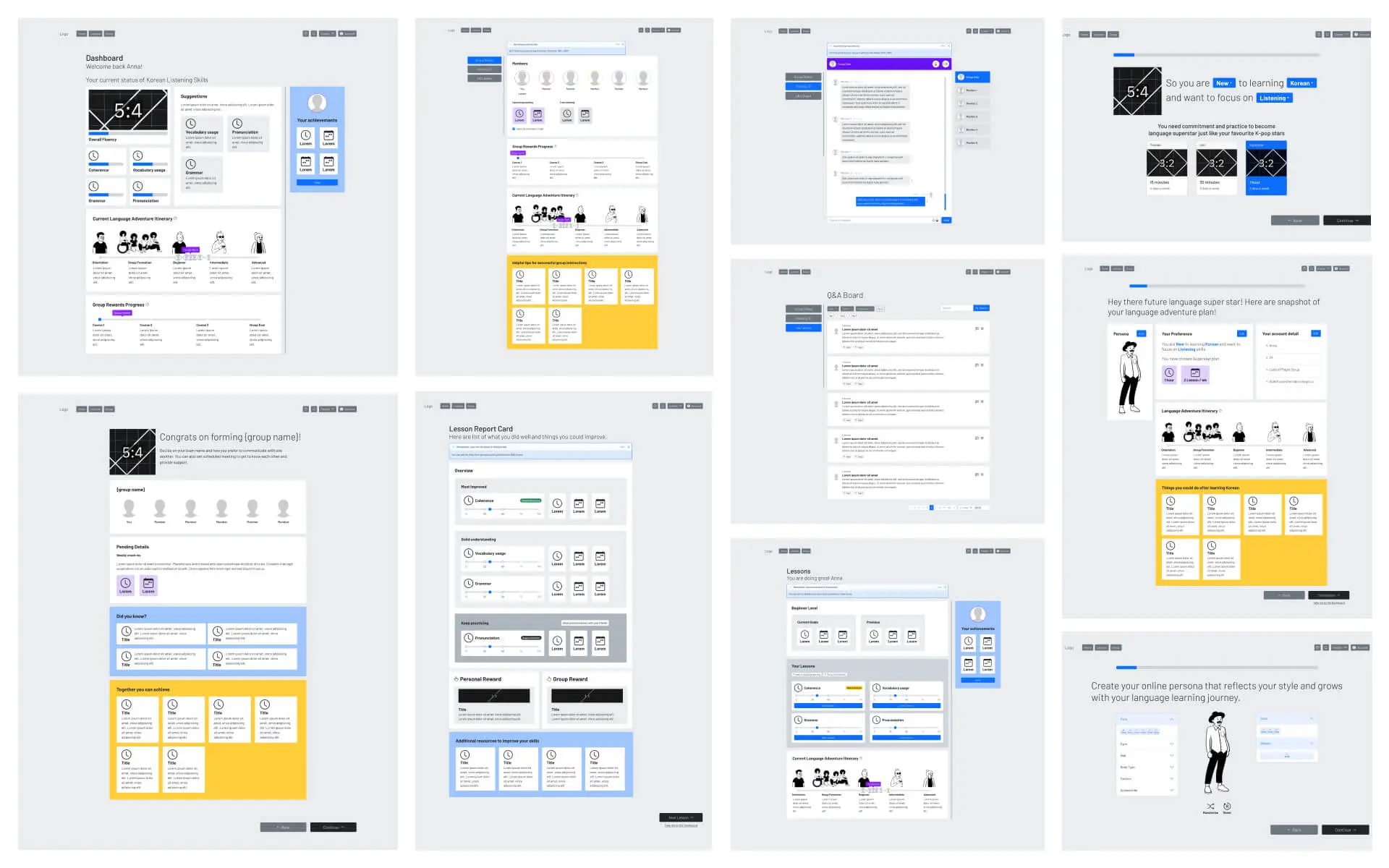
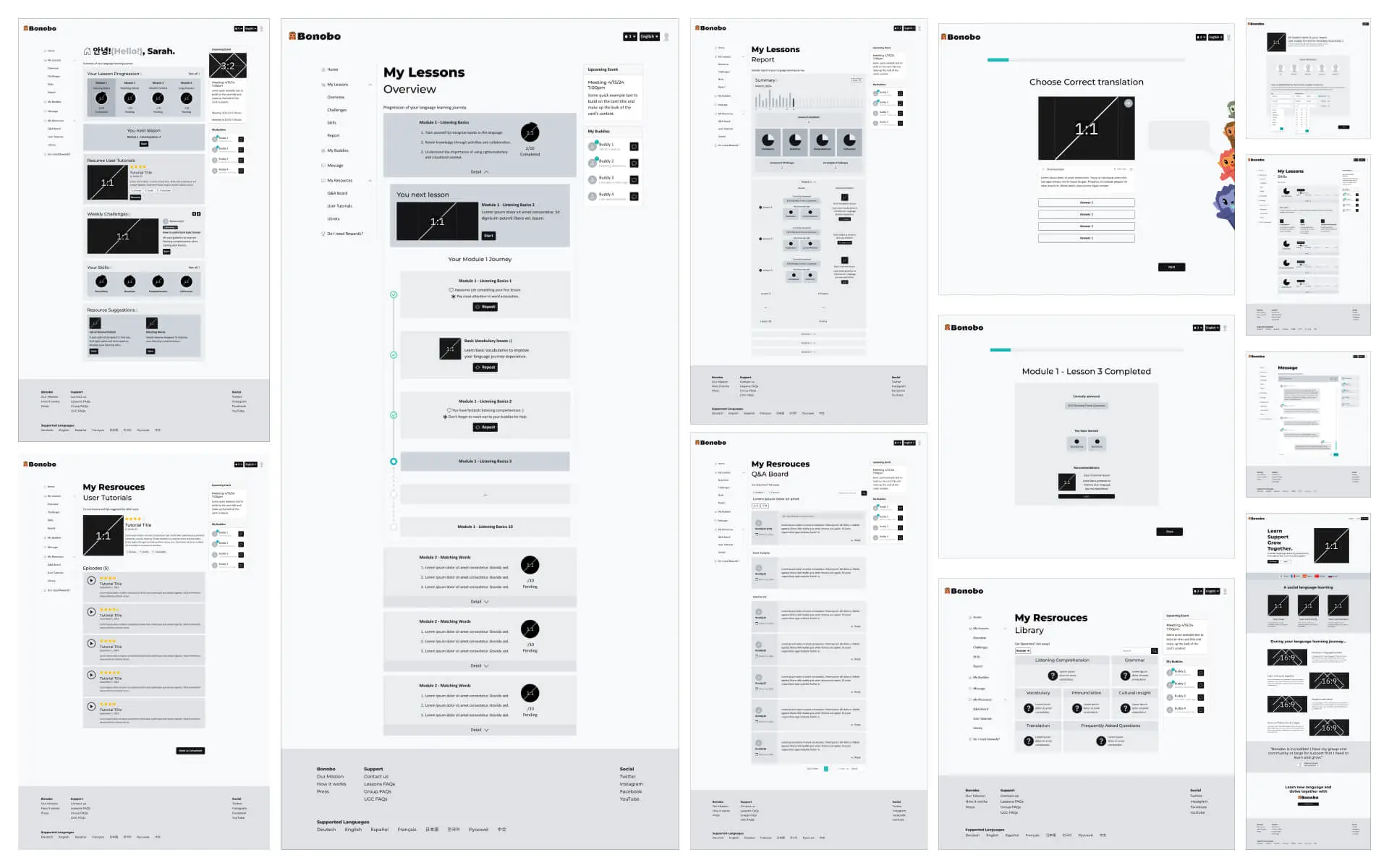
The proposed language learning platform focuses on building confidence through both individual and group activities. It integrates a strong community support system, embraces meaningful context-based learning, and effectively brings the supportive elements of in-person learning into the online environment.
Including Key User Feedback into the Final Design
Project Scope
Testers noted that the project's scope is quite broad, and some features were perceived as overly complex.
Key Feature Focus
Testers recommended narrowing the design effort to a few essential features that effectively showcase the platform's core concept.
Streamlined Information Flow
Testers emphasized optimizing the flow of information to enhance the user experience by providing clear and relevant context.
Resource Saving Functionality
Testers proposed adding a feature to allow users to save shared resources into personal collections for easy study reference.
Study Buddies with common goals
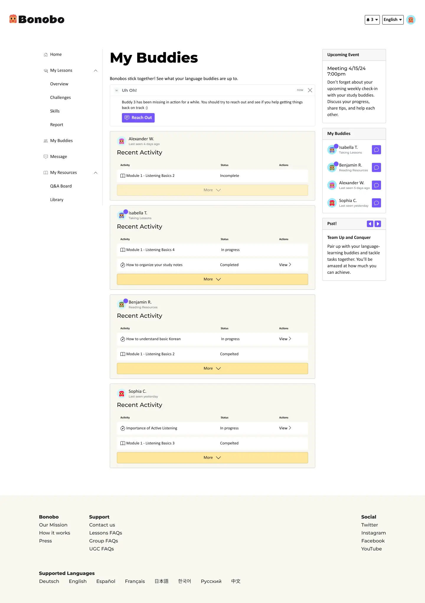
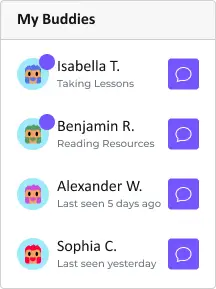
Your buddies are just a click away—learn, support, and grow together.
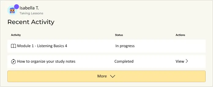
Track your buddies' progress on their language-learning journey. A little positive peer pressure can work wonders as a motivator.
Personalized Approach
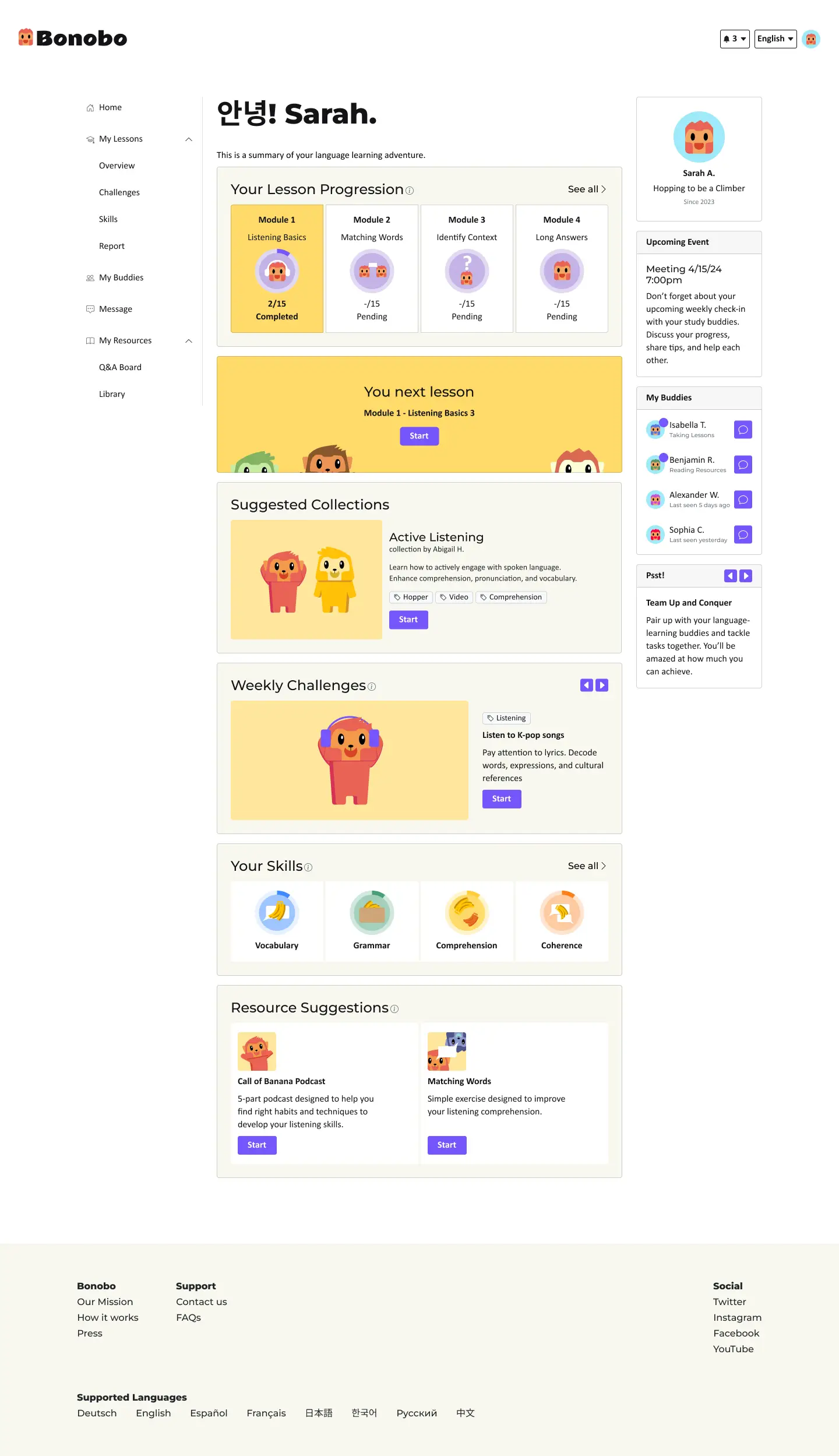
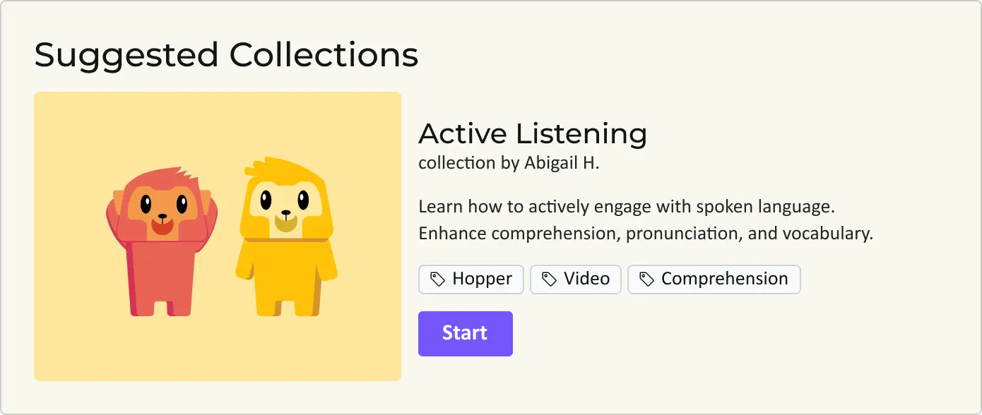
Recommend user created resource collections to develop skill sets complimentary to personal goal.
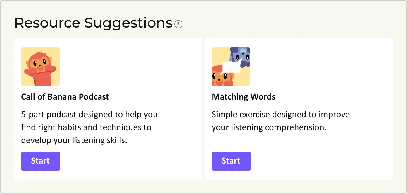
Resource suggestions based on predetermined interests and overall lesson progression.
Language Learning Adventure
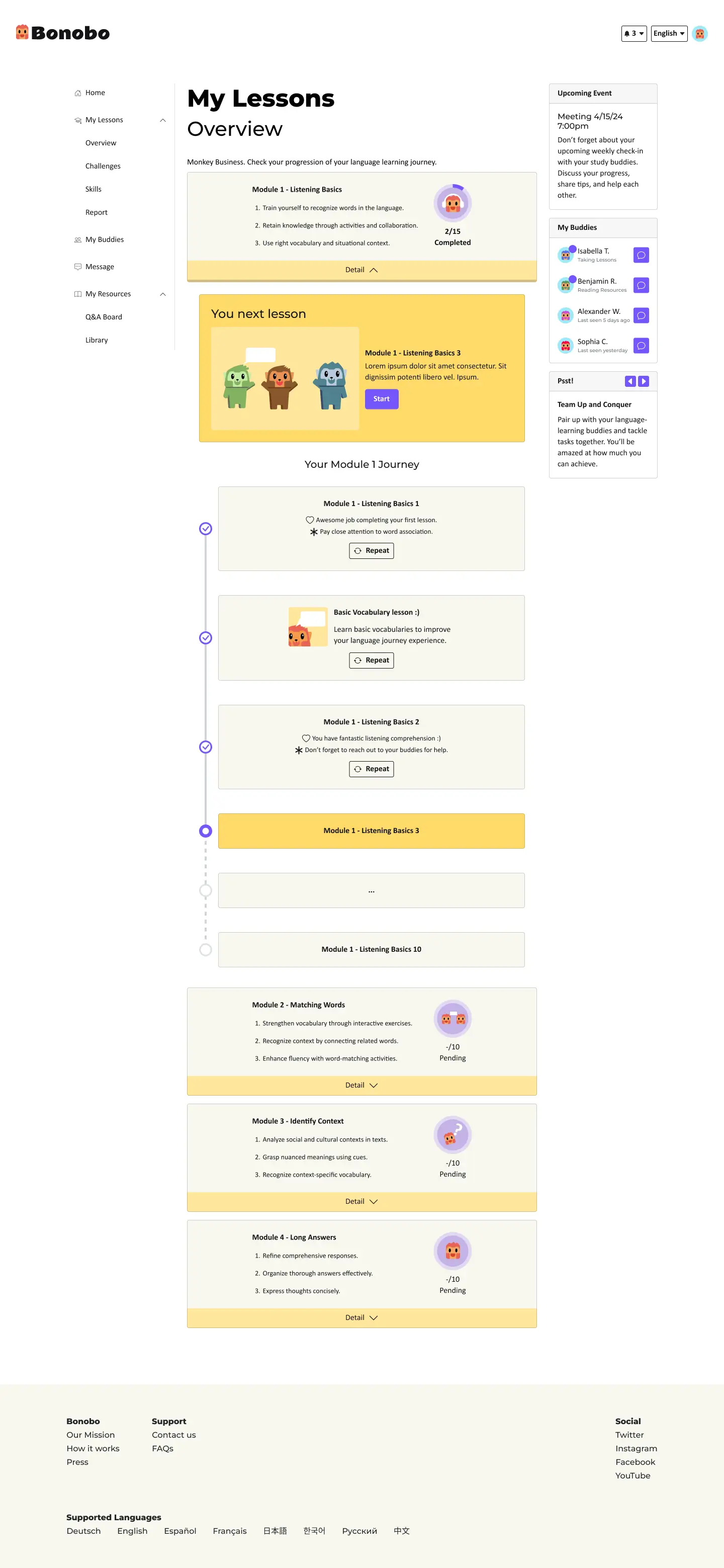

Easy-to-comprehend core objectives match user needs. Simplified and meaningful gamification targets milestone achievements.
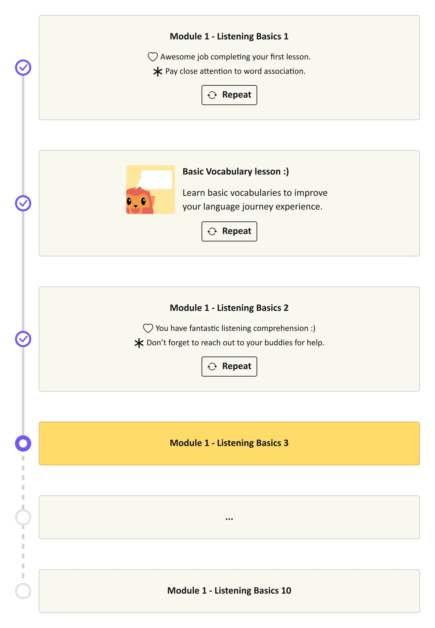
Visualized progression tracking with individual lesson highlights.
Feedback with Context
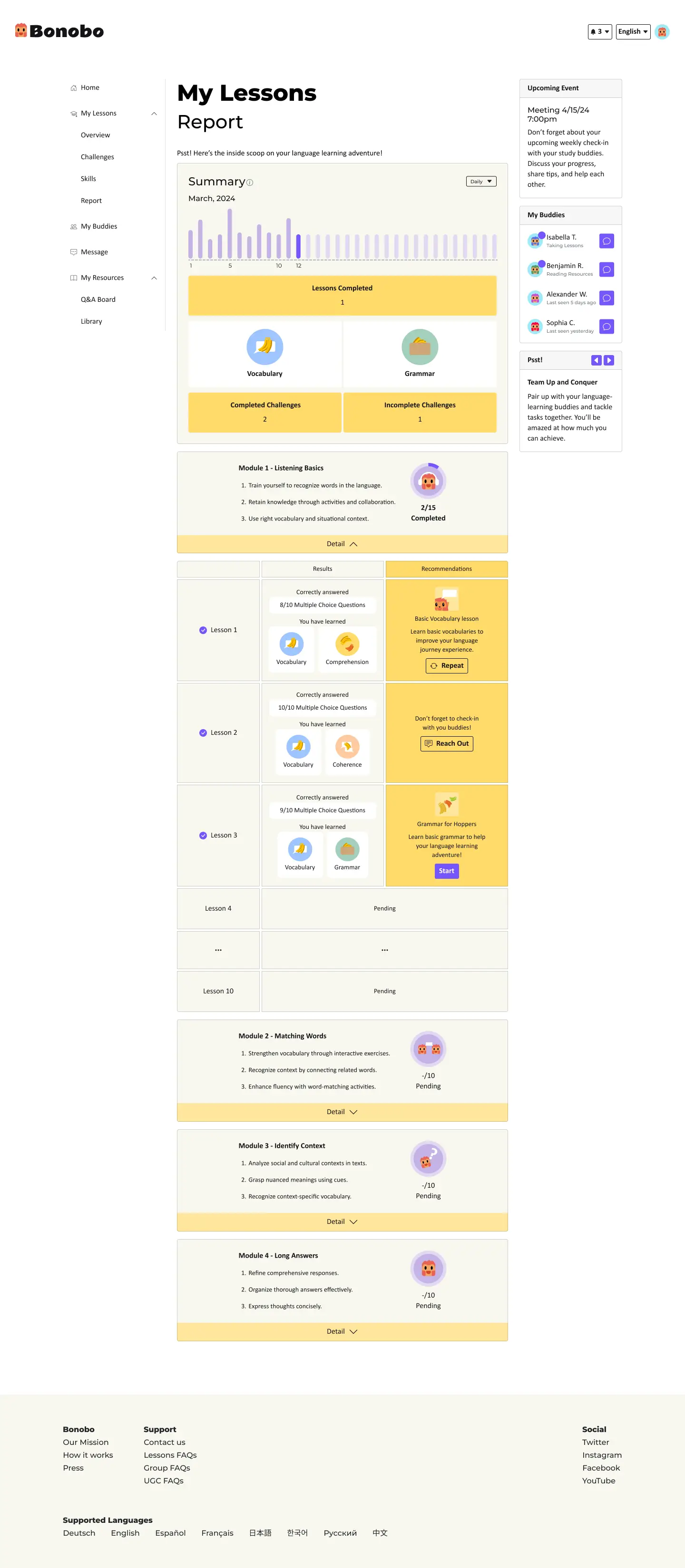
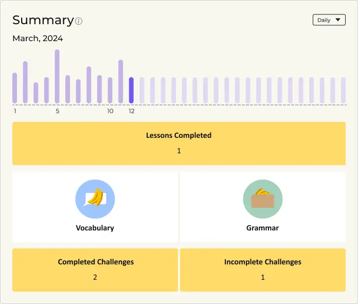
Customizable overview of activities with balanced feedback to aid users.
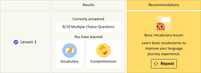
Detailed summary for each lesson with achievements and recommended resources.
Language Learning Adventure
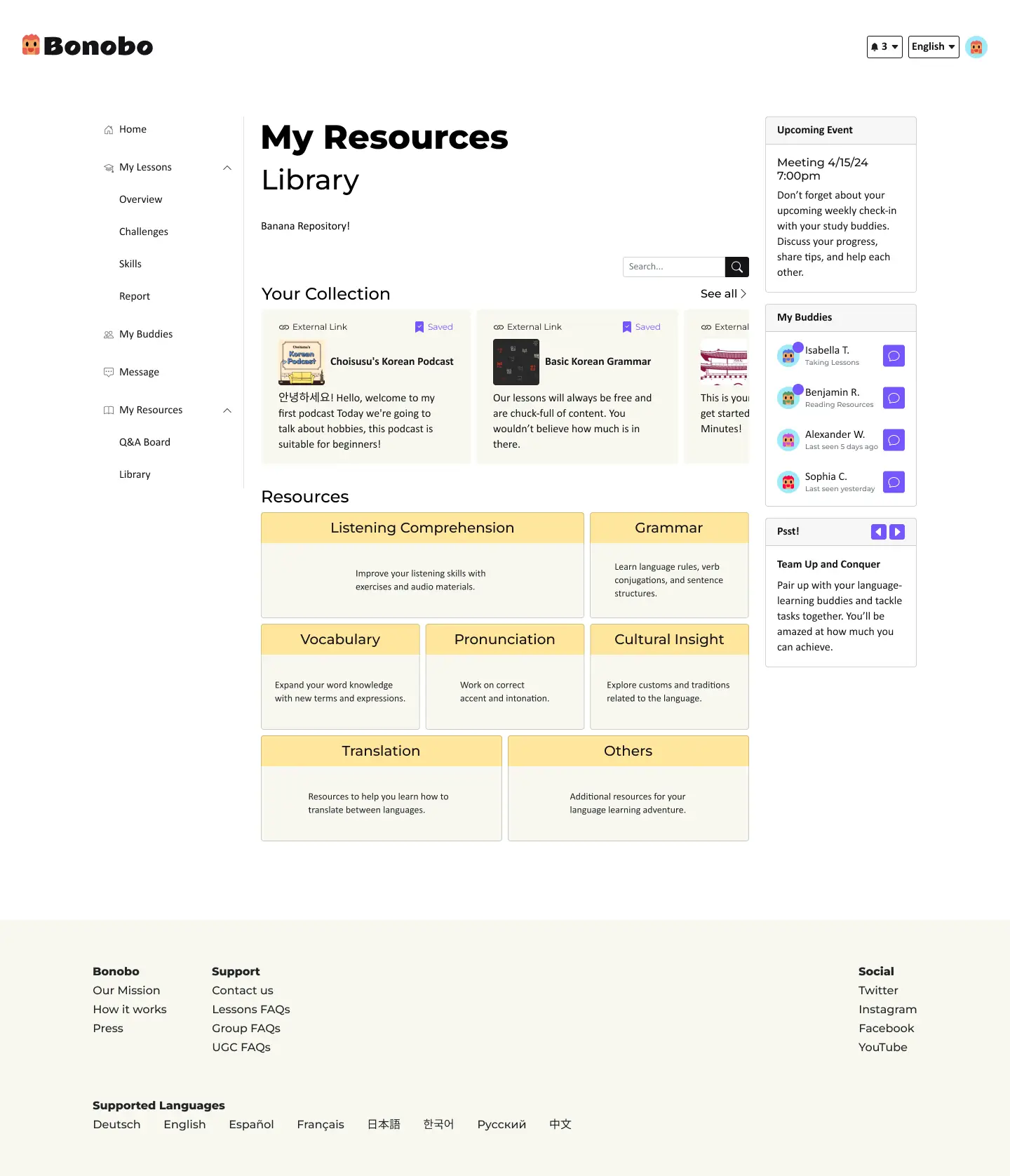

No need to go anywhere else for help. Share resources to help each other’s language learning.

Save shared resources to different collections as study references. It can be shared with others just like a playlist.

Results
Introducing Bonobo, a Social Language Learning Experience
Bonobo brings the social interaction of in-person learning into online spaces. It encourages users to connect, collaborate, and share experiences with language partners and the wider community, creating a dynamic and supportive environment for collective growth and learning. This has been positively received for its focus on fostering meaningful connections.
Future Design Enhancements
Seamless support Integration
Incorporate mentorship and collaborative features to create a more cohesive community experience.
Refining community contributions
Create a community-driven resource database that integrates various user collections to enrich language learning experiences.
That’s a wrap!
Thank you for reading my case study. Ready for another?
